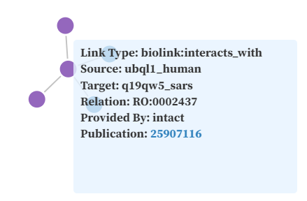
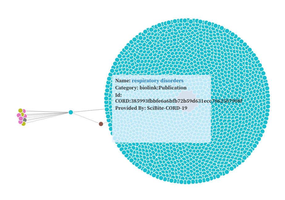
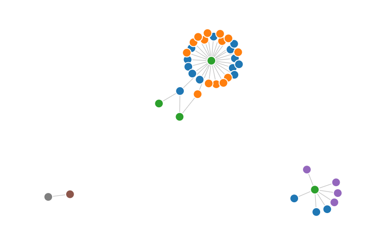
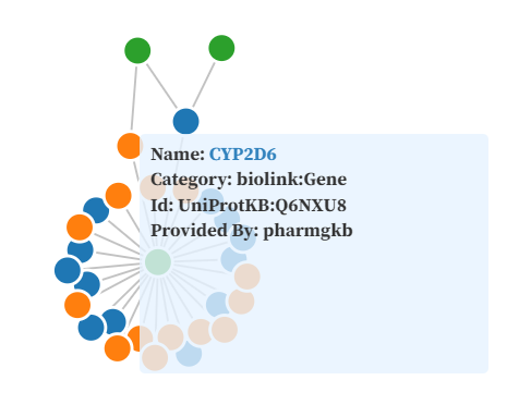
A one-stop representation of COVID-19 data is an important step in helping to manage the current pandemic. Some issues to create this one-stop representation is combining and integrating all the knowledge from different datasets and documents into a single unified representation and a lack of a readily available visual tool which can help understand this knowledge. I therefore propose on such tool as a part of this project. The tool will rely on a rich knowledge graph at it's back-end and an interactive web based front-end to visualize the relations between different technical terms as learned from gaining knowledge from all the documents. The tool builds an interactive force-directed network graph to leverage the rich knowledge of KG-COVID-19 with an option to dynamically filter our particular individual as well as groups of relations between the nodes.
Project Report
Along with a Python Notebook for cleaning the data I develop the following Observable Notebook which can be used for the visualizations. It has the following 3 types of Viz currently
The
Vis Notebook is pretty self explainatory regarding the prerequisites
required to generate the data files. For system requirements and source code
information refer README.
1. Use the generate_bubble_chart_data function to get csv files for the Bubble
charts. It requires two parameters type of data (nodes/edges) and name of
categorical attribute.
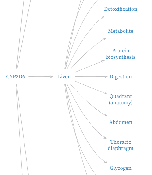
2. Use the create_data_json to generate data for force directed graph. It
requires a starting node keyword along with two optional attributes. By
default the script will not generate a file if the number of edges is less
than 100, if you still want to generate data set the generate_flag to True.
The depth of the search can be controlled via the depth attribute.