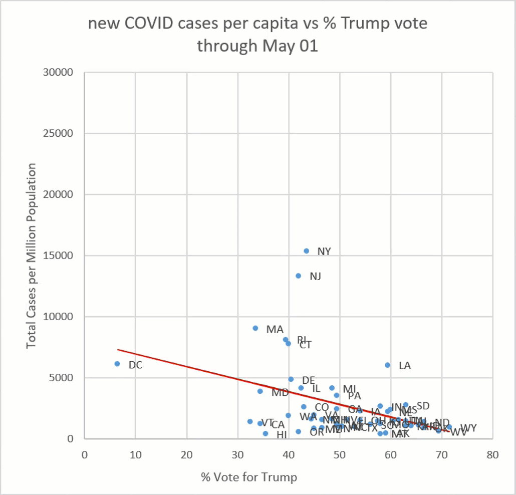
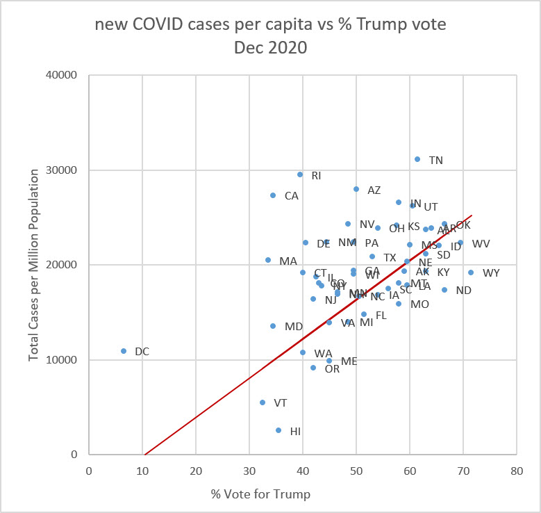
The data are plotted for each state as per-capita cases in each month (vertical axis) as a function of % vote for Donald Trump in the November election (horizontal axis). The red line is the best linear fit to the data. Each state will always appear at the same % vote.
In the early months of the pandemic, the blue states (left side of graph) had more cases of COVID. The virus first came ashore in New York, Washington and California. After the president began making wearing a mask an act of defiance against government control, the states that eventually voted for him in November began to ignore the advice to wear a mask.
Starting in June and July, the cases of COVID began to rise in red states (right side of graph). Note larger vertical scale of the one-month plot on the right.
us per-capita maps
data from CDC