There is a People Power position paper on a "downhill bikes use full
lane" sign.
![]() Click here for paper.
Click here for paper.
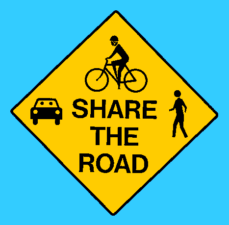
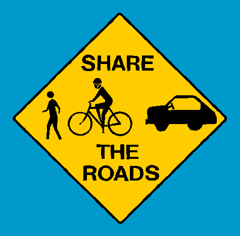
Here is a picture of the new "share-the-road" warning sign that has
been going up around Santa Cruz County:
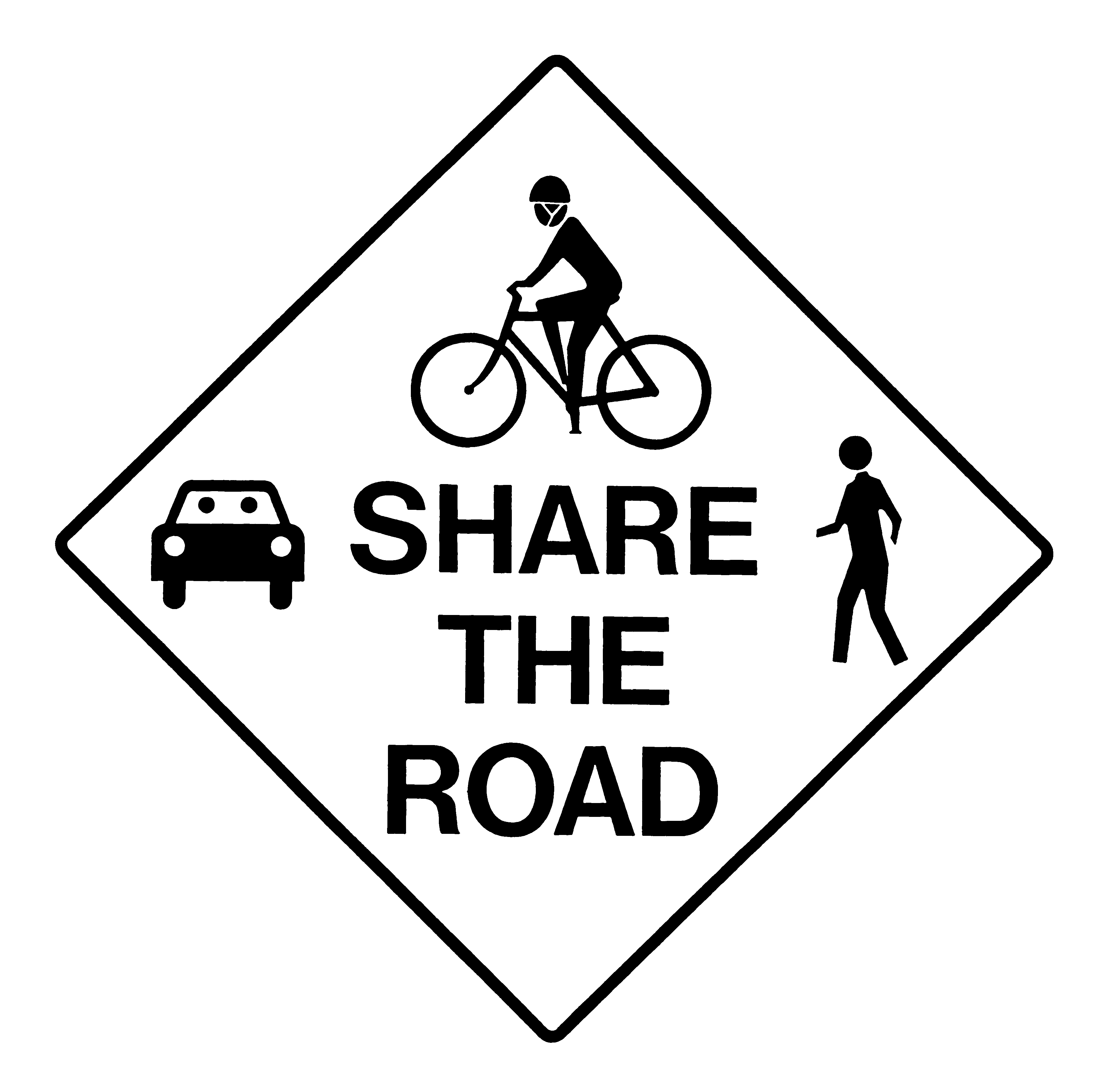
 72 dot-per-inch (6,606 bytes)
 600 dot-per-inch (Black and white, 72,498 bytes)
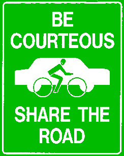
There is also an informational sign, which I don't care much for, since it seems to imply that sharing means cars passing bikes. Informational signs are only needed where cars may have to wait for an opportunity to pass bikes, so the visual message seems inappropriate.
 72 dot-per-inch (4,648 bytes)
 600 dot-per-inch (83,615 bytes)
The designs are not mine, but were done by the Santa Cruz Community Traffic Safety Coalition, primarily by volunteer efforts of the sign shop at UCSC. To the best of my knowledge the sign designs are in the public domain, though it would be good to credit the Santa Cruz Community Traffic Safety Coalition if you are trying to convince someone to use the sign.
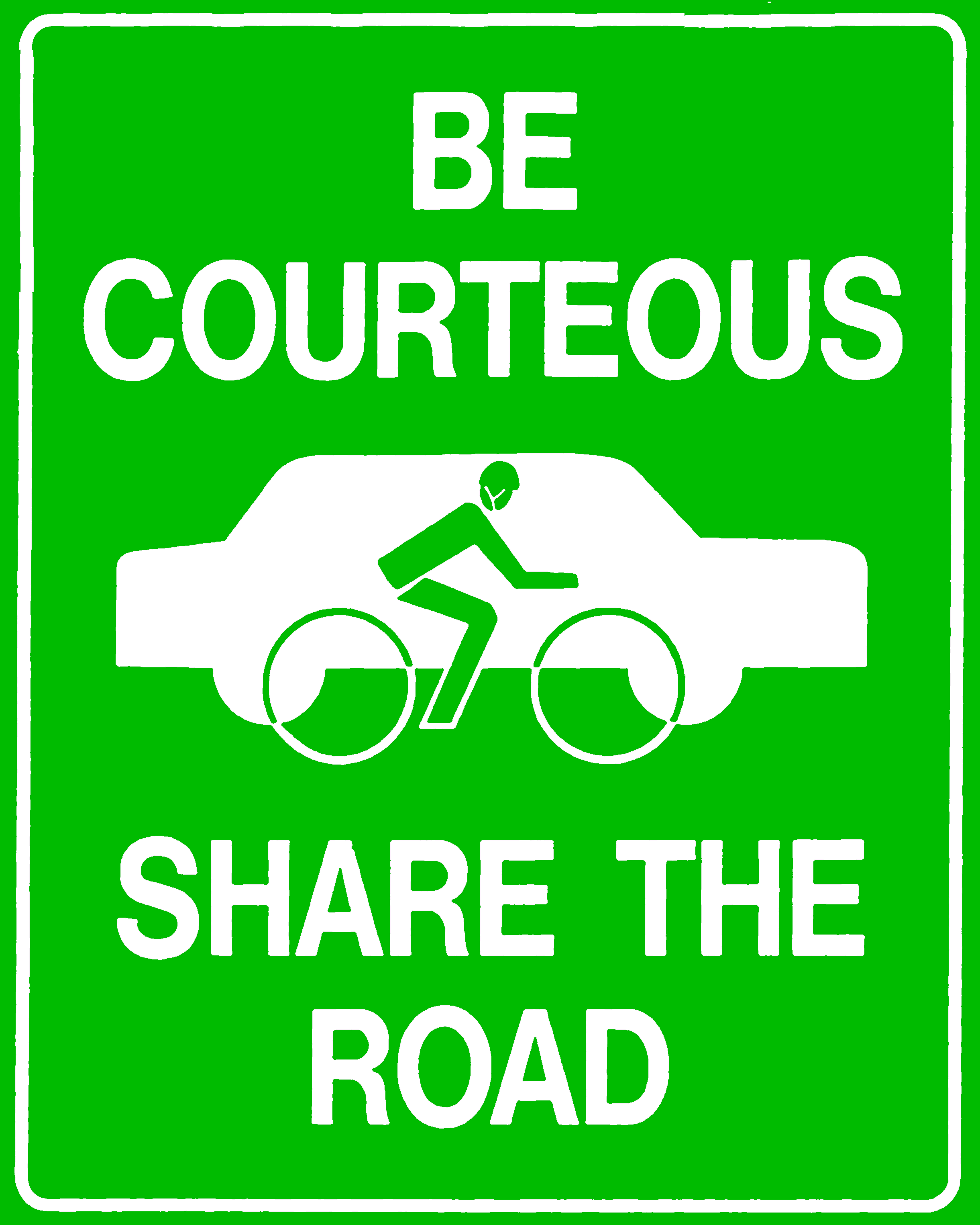
Bob Tyson, lkrndu@bitstream.net, did not like the Santa Cruz signs. He says
Here's mine, based on the design shown on your web page. Yes, it's "roadS" -- and the vehicles, like the cartoon of Homo Sapiens leading the parade out of the ooze, follow one another, a bit more crowded than one might like.BUT-- that's the very point. In this case, things could be smoothed out a little but the visual crowding is a subliminal reminder of the reason and the urgency for the imperative: "Share!"
And the order of things, walker, then bike and driver, and then automobile, seems just-- with the right-to-left order of the dominating motor vehicle "chasing" the weaker species colliding with our culturally-conditioned right-to-left scan, and that last reinforced by the position of such a warning sign, almost always on our right as we use the roads.
 Tyson's sign, 72dpi.
(Note: I cleaned up his image slightly to make it compress
better---the colors were inadvertently changed in the process.)
Tyson's sign, 72dpi.
(Note: I cleaned up his image slightly to make it compress
better---the colors were inadvertently changed in the process.)
Personally, I find this sign no better than the Santa Cruz one. Just as "Share the Road" can be misinterpreted as "this lane is mine, that lane is yours", "Share the Roads" can be misinterpreted as "this road is mine, that road is yours".
The order of the icons probably makes little difference to the motorist getting a quick glance. If you want to give the impression of the motorist in the back, you need the motorist on the left-hand side of the sign, and everyone facing to the right.
The only real improvement I see in this sign is having all the road users facing the same direction, instead of having the motorist head-on and the cyclist and pedestrian sideways.