Matplotlib
An extensive examples of using Matplotlib is found at Matplotlib example site.
See also a summary of pyplot commands.
Some useful plotting options are also found at Scipy note.
Introduction
matplotlib is probably the single most used Python package for 2D-graphics.
It provides both a very quick way to visualize data from Python and publication-quality figures
in many formats. We are going to explore matplotlib in interactive mode covering most common cases.
We also look at the class library which is provided with an object-oriented interface.
IPython
IPython is an enhanced interactive Python shell that has lots of interesting features
including named inputs and outputs, access to shell commands,
improved debugging and many more. When we start it with the command line argument --pylab,
it allows interactive matplotlib sessions that has Matlab/Mathematica-like functionality.
pylab
pylab provides a procedural interface to the matplotlib object-oriented plotting library.
It is modeled closely after Matlab(TM). Therefore, the majority of plotting commands in pylab
has Matlab(TM) analogs with similar arguments.
Important commands are explained with interactive examples.
Note
pylab includes not only matplotlib but also numpy.
Matplotlib and pylab
There are nice tools for making plots of 1d and 2d data (curves, contour plots, etc.) in the module matplotlib. Many of these plot commands are very similar to those in Matlab.
To see some of what’s possible (and learn how to do it), visit the matplotlib gallery. Clicking on a figure displays the Python commands needed to create it.
The best way to get matplotlib working interactively in a standard Python shell is to do:
$ python
>>> import numpy as np
>>> import matplotlib.pyplot as plt
>>> plt.interactive(True)
>>> x = np.linspace(-1, 1, 20)
>>> plt.plot(x, x**2, 'o-')
Notice also that, since pylab includes both matplotlib and numpy,
you can get the exact same features using a more compact way as follow:
$ python
>>> import pylab
>>> pylab.interactive(True)
Then you should be able to do:
>>> x = pylab.linspace(-1, 1, 20)
>>> pylab.plot(x, x**2, 'o-')
and see a plot of a parabola appear. See Figure 1.
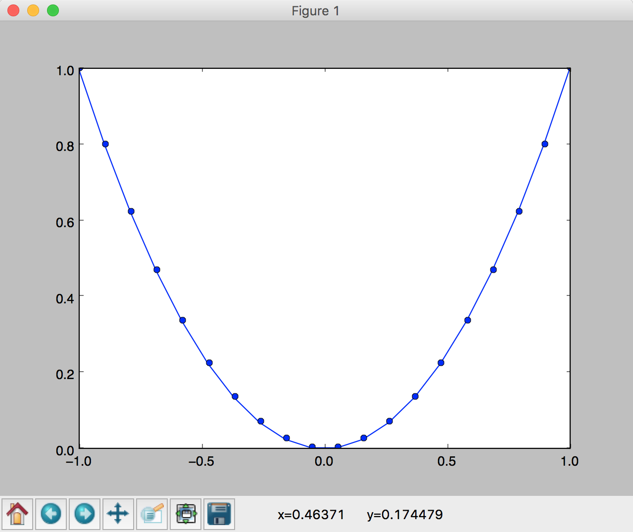
Figure 1: A simple plot of  .
.
You should also be able to use the buttons at the bottom of the window, e.g click the magnifying glass and then use the mouse to select a rectangle in the plot to zoom in.
Alternatively, you could do:
>>> from pylab import *
>>> interactive(True)
With this approach you don’t need to start every pylab function name with pylab, e.g.:
>>> x = linspace(-1, 1, 20)
>>> plot(x, x**2, 'o-')
In these notes we’ll generally use module names just so it’s clear where things come from.
If you use the IPython shell instead, you can do:
$ ipython --pylab

In [1]: x = linspace(-1, 1, 20)
In [2]: plot(x, x**2, 'o-')
The --pylab flag causes everything to be imported from pylab and set up for
interactive plotting.
Labels, titles, grids, overplots, legends
We continue using a plotting mode in a standard Python shell in our first example.
To add titles in  and
and  axes, and a plot title:
>>> plt.xlabel('x')
<matplotlib.text.Text object at 0x10aeb5710>
>>> plt.ylabel('y')
<matplotlib.text.Text object at 0x1053b6f10>
>>> plt.title('y=x^2')
Note
To use greek letters as in LaTex, you should use raw strings
(precede the quotes with an r) and surround the math text with
dollar signs ($), as in TeX. For example:
>>> plt.xlabel(r'$\alpha$')
One can also put some grid lines:
>>> plt.grid(True)
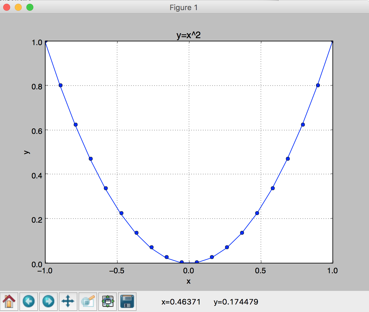
Figure 2: A simple plot of .
We now consider a more richful example of plotting more than one functions in the same figure. In the script below, we’ve instantiated (and commented) all the figure settings that influence the appearance of the plot. The settings have been explicitly set to their default values, but now you can interactively play with the values to explore their effects (see Line properties and Line styles below).
1 2 3 4 5 6 7 8 9 10 11 12 13 14 15 16 17 18 19 20 21 22 23 24 25 26 27 28 29 30 31 32 33 34 35 36 37 38 39 40 41 42 43 44 45 46 47 48 49 50 51 52 53 54 55 56 57 58 59 60 61 62 63 64 65 66 67 68 69 70 71 72 73 74 75 76 77 | """
/lectureNote/chapters/chapt05/codes/plot_sin_cos.py
The original code is from
http://www.scipy-lectures.org/intro/matplotlib/matplotlib.html
and the current version has been slightly modfied by Prof. Dongwook Lee
for AMS 209, Fall.
"""
import numpy as np
import matplotlib.pyplot as plt
# (1) Inactivate the interactive mode
# you then need to have plt.show() at the end to see your figures
# (2) If True, you don't need to have plt.show(), but sometimes interacting with figures
# can be sluggish...
plt.interactive(False)
# Create a figure of size 8x6 inches, 80 dots per inch
plt.figure(figsize=(8, 6), dpi=80)
# Tuple initializations of cos and sin
X = np.linspace(-np.pi, np.pi, 256, endpoint=True)
C, S = np.cos(X), np.sin(X)
# Plot cosine with a blue continuous line of width 3.0 (pixels)
plt.plot(X, C, color="blue", linewidth=3.0, linestyle="-.")
# Plot sine with a green continuous line of width 2.5 (pixels)
plt.plot(X, S, color="green", linewidth=2.5, linestyle="-",marker='d',markersize=10)#, mec='k')
# the last keyword argument (mec='k') is for marker edge color with black (k).
# Set x label
plt.xlabel('$x$')
# Set x limits
plt.xlim(-4.0, 4.0)
# Set x ticks
#plt.xticks(np.linspace(-4, 4, 9, endpoint=True))
plt.xticks([-np.pi, -np.pi/2, 0, np.pi/2, np.pi], [r'$-\pi$', r'$-\pi/2$', r'$0$', r'$+\pi/2$', r'$+\pi$'])
# Set y label
plt.ylabel('$y$')
# Set y limits
plt.ylim(-1.0, 1.0)
# Set y ticks
#plt.yticks(np.linspace(-1, 1, 5, endpoint=True))
plt.yticks([-1, 0, +1], [r'$-1$', r'$0$', r'$+1$'])
# Set title
plt.title('$y=\sin(x)$ and $y=\cos(x)$ over $[-\pi, \pi]$')
# Set legend
plt.legend(('$\cos(x)$', '$\sin(x)$'), loc='upper left')
# Add a text
# figtext uses figure coordinates form 0 to 1:
plt.figtext(0.77,0.75,'this is $\sin(x)$')
plt.figtext(0.25,0.6,'this is $\cos(x)$')
# Save figure using 72 dots per inch
# plt.savefig("exercice_2.png", dpi=72)
# Show result on screen
# You need this when using plt.interactive(False)
plt.show()
|
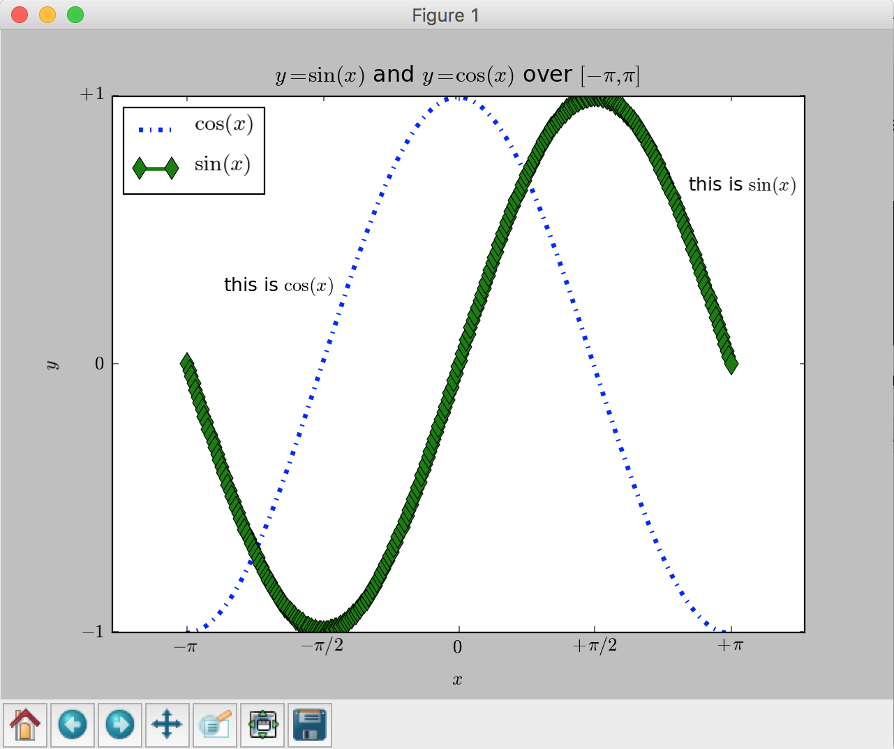
Figure 3: A figure of  and
and  functions over
 ![[-\pi,\pi]](../../_images/math/c744c190f7b4d11265cb61031a835d3db85bf51d.png) .
.
The next example demonstrates a simple way to read in a FLASH 2D data, extract a 1D slice, and plot a 1D density profile. The test problem is called the Shu-Osher hydrodynamics shock tube problem, details of which is available at the FLASH users guide.
1 2 3 4 5 6 7 8 9 10 11 12 13 14 15 16 17 18 19 20 21 22 23 24 25 26 27 28 29 30 31 32 33 34 35 36 37 38 39 40 41 42 43 44 45 46 47 48 49 50 51 52 53 54 55 56 | """
/lectureNote/chapters/chapt05/codes/plot_flash_1d.py
An example Python 1d plotting code using a FLASH 2d data
-- The Shu-Osher hydrodynamics shock tube problem
on a uniform grid of size 200 x 8
See more examples and options at:
http://matplotlib.org/gallery.html
http://matplotlib.org/users/image_tutorial.html
Written by Prof. Dongwook Lee, for AMS 209, Fall.
"""
import h5py
import numpy as np
import os
import sys
import matplotlib.pyplot as plt
def plot_flash_1d(file,yslice=0,var='dens',color='black',marker='d') :
var4plot = file[var]
print var4plot.shape
#plt.xlim(-4.5,4.5)
dx = 9./200.
x = np.linspace(-4.5 + 0.5*dx, 4.5, 200)
plt.plot(x, var4plot[0,0,yslice,:],color=color,marker=marker) # plot a 1D section from a 2D data
# read in a data
file = h5py.File('ppm-hllc_hdf5_chk_0009', 'r')
# plot 1D graph
#plot_flash_1d(file,yslice=4)
plot_flash_1d(file,yslice=4,var='dens',color='blue')
plot_flash_1d(file,yslice=4,var='pres',color='green',marker='o')
# Set x label
plt.xlabel('$x$')
# Set y label
plt.ylabel(r'$\rho$, $p$')
# legend
plt.legend((r'density, $\rho$', 'pressure, p'), loc='center left')
# show to screen
plt.show()
# close the file
file.close()
|
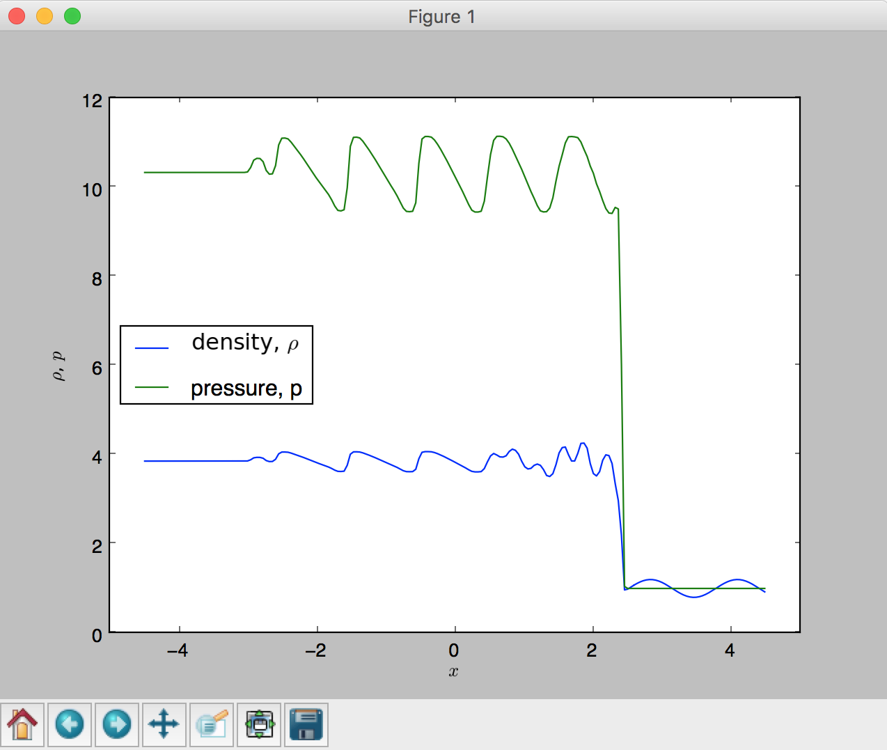
Figure 4: A 1D density profile of the Shu-Osher shock tube problem.
Advanced plots – 2D, 3D plots, subplots and more
We have so far only covered some basic features of producing 1D plots. Obviously there are lot more
to learn. We briefly take a look at an example which produces 2D and 3D plots of a FLASH code simulation.
The simulation is a 2D Sedov explosion on a uniform grid of size  (see more about the problem in the FLASH users guide ).
1 2 3 4 5 6 7 8 9 10 11 12 13 14 15 16 17 18 19 20 21 22 23 24 25 26 27 28 29 30 31 32 33 34 35 36 37 38 39 40 41 42 43 44 45 46 47 48 49 50 51 52 53 54 55 56 57 58 59 60 61 62 63 64 65 66 67 68 69 70 71 72 73 74 75 76 77 78 79 80 81 82 83 84 85 86 87 88 89 90 91 92 93 94 95 96 97 98 99 100 101 102 103 104 105 106 107 108 109 110 111 112 113 114 115 116 117 118 119 120 121 122 123 124 125 126 127 128 129 130 131 132 133 134 135 136 137 138 139 140 141 142 143 144 145 146 147 148 149 150 151 152 153 154 155 156 157 158 159 160 161 162 163 164 165 166 167 | """
/lectureNote/chapters/chapt05/codes/plot_flash_2d.py
An example Python plotting code using a FLASH 2d data
-- Sedov explosion on a uniform grid of size 256 x 256
See more examples and options at:
http://matplotlib.org/gallery.html
http://matplotlib.org/users/image_tutorial.html
Written by Prof. Dongwook Lee, for AMS 209, Fall.
"""
import h5py
import numpy as np
import os
import sys
import matplotlib.pyplot as plt
from mpl_toolkits.mplot3d import Axes3D
def plot_flash_2d(file,var='dens') :
var4plot = file[var]
#print var4plot.shape
plt.plot(var4plot[0,0,:,:])
def plot_flash_2d_imshow(file,var='dens') :
var4plot = file[var]
#print var4plot.shape
box = get_box(file,'bounding box')
xmin = box[0][0]
xmax = box[0][1]
ymin = box[1][0]
ymax = box[1][1]
#plt.axis([xmin, xmax, ymin, ymax])
plt.imshow(var4plot[0,0,:,:],extent=[xmin,xmax,ymin,ymax])
plt.colorbar()
def plot_flash_2d_surface(file,var='dens') :
var4plot = file[var]
#print var4plot.shape
plt.imshow(var4plot[0,0,:,:])
def get_2d_vars(file,var='dens') :
var4plot = file[var]
return var4plot[0,0,:,:]
def get_ngrids(file,var='integer scalars'):
coords = file[var]
for i,value in enumerate(file[var][:]):
if ('nxb' in value[0]):
nx = value[1]
elif ('nyb' in value[0]):
ny = value[1]
elif ('nzb' in value[0]):
nz = value[1]
ngrids = [nx,ny,nz]
return ngrids
def get_box(file,var='bounding box'):
xbox = file[var][0][0]
ybox = file[var][0][1]
zbox = file[var][0][2]
box = (xbox, ybox, zbox)
return box
def get_coords(file):
box = get_box(file,'bounding box')
ngrids = get_ngrids(file,'integer scalars')
xmin = box[0][0]
xmax = box[0][1]
ymin = box[1][0]
ymax = box[1][1]
zmin = box[2][0]
zmax = box[2][1]
dx = (xmax-xmin)/ngrids[0]
dy = (ymax-ymin)/ngrids[1]
dz = (zmax-zmin)/ngrids[2]
x = np.arange(xmin+0.5*dx, xmax, dx)
y = np.arange(ymin+0.5*dy, ymax, dy)
z = np.arange(zmin+0.5*dz, zmax, dz)
X,Y = np.meshgrid(x,y)
return (x,y,X,Y)
# open FLASH data file
file = h5py.File('sedov_hdf5_chk_0005', 'r')
# get coordinates
(x,y,X,Y) = get_coords(file)
# get data to plot, e.g., density in this case.
Z = get_2d_vars(file)
#print X.shape, Y.shape, Z.shape
# =======================================
# (1) 1D slice plot
fig = plt.figure()
plt.plot(x,Z[128,:])
# Set x label
plt.xlabel('$x$')
# Set y label
plt.ylabel(r'$\rho$ at $y=0.5$')
# Set title
plt.title('1d slice plot of density')
# =======================================
# (2) 2D plot
fig = plt.figure()
plot_flash_2d_imshow(file)
plt.xlabel('$x$')
plt.ylabel('$y$')
plt.title('2d plot of density')
# =======================================
# (3) 3d surface plot
fig = plt.figure()
ax = Axes3D(fig)
ax.plot_surface(X,Y,Z, rstride=4, cstride=4, cmap='hot')
plt.xlabel('$x$')
plt.ylabel('$y$')
plt.title('3d surface plot of density')
# =======================================
# (4) 3d wireframe plot
fig = plt.figure()
ax = Axes3D(fig)
ax.plot_wireframe(X,Y,Z, rstride=8, cstride=8, cmap='hot')
plt.xlabel('$x$')
plt.ylabel('$y$')
plt.title('3d wireframe plot of density')
# =======================================
# (5) 3d contour-filled plot
fig = plt.figure()
ax = Axes3D(fig)
ax.contourf(X, Y, Z)
plt.xlabel('$x$')
plt.ylabel('$y$')
plt.title('3d contour plot of density')
# =======================================
# Show plots to screen
plt.show()
# close file
file.close()
|
- 1D slice plot using
plot, lines 111 - 122:
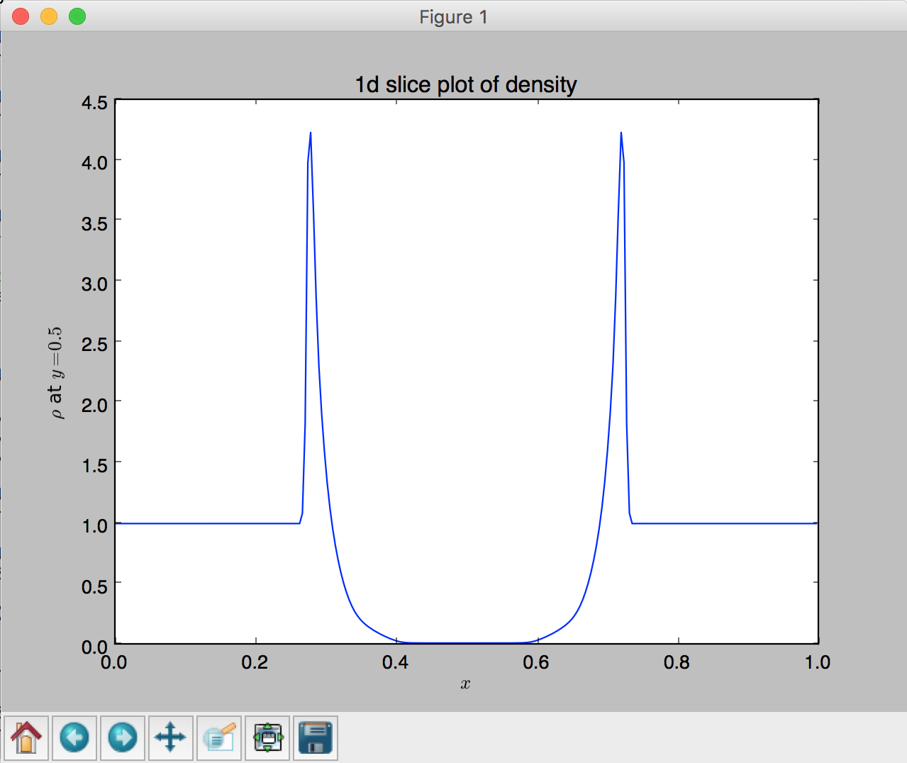
Figure 5: 1D slice plot of 2D density at t=0.05.
- 2D plot using
imshow, lines 126 - 131:
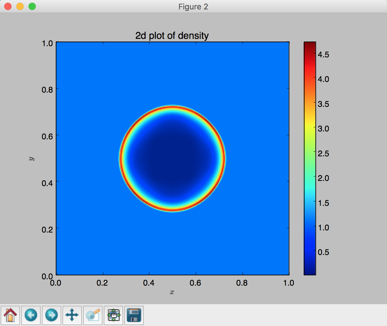
Figure 6: 2D pseducolor plot of density at t=0.05.
- 3D surface plot using
plot_surface, lines 134 - 140:
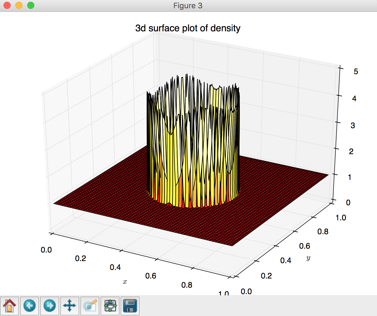
Figure 7: 3D surface plot of density at t=0.05.
- 3D wireframe plot using
plot_wireframe, lines 144 - 150:
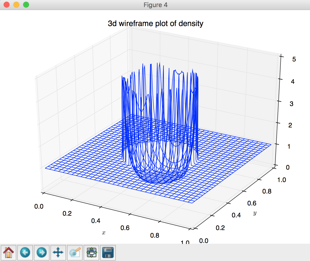
Figure 8: 3D wireframe plot of density at t=0.05.
- 3D contour plot using
contourf, lines 153 - 159:
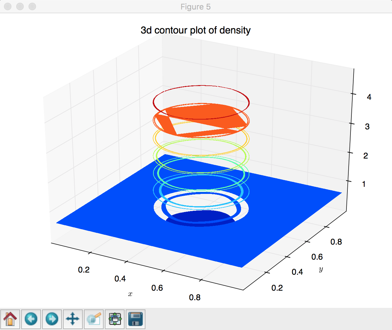
Figure 9: 3D contour plot of density at t=0.05.
One can also produce a plot with multiple subplots:
1 2 3 4 5 6 7 8 9 10 11 12 13 14 15 16 17 18 19 20 21 22 23 24 25 26 27 28 29 30 31 32 33 34 35 36 37 38 39 40 41 42 43 44 45 46 47 48 49 50 51 52 53 54 55 56 57 58 59 60 61 62 63 64 65 66 67 68 69 | """
/lectureNote/chapters/chapt05/codes/plot_flash_subplot.py
An example Python subplotting code using a FLASH 2d data
-- Sedov explosion on a uniform grid of size 256 x 256
See more examples and options at:
http://matplotlib.org/gallery.html
http://matplotlib.org/users/image_tutorial.html
Written by Prof. Dongwook Lee, for AMS 209, Fall.
"""
import h5py
import numpy as np
import os
import sys
import matplotlib.pyplot as plt
from mpl_toolkits.mplot3d import Axes3D
# =======================================
# 2D subplots
maxDens = -1.0
minDens = 1.e10
for i in range(1,7,1):
fileName = 'sedov_hdf5_chk_000'+str(i)
file = h5py.File(fileName, 'r')
var = file['dens']
if var[0,0,:,:].max() > maxDens:
maxDens = var[0,0,:,:].max()
if var[0,0,:,:].min() < minDens:
minDens = var[0,0,:,:].min()
fig,axes = plt.subplots(nrows=3,ncols=2)
print fig,axes
for i in range(1,7,1):
print i
fileName = 'sedov_hdf5_chk_000'+str(i)
print fileName
file = h5py.File(fileName, 'r')
var = file['dens']
#plot_flash_2d_imshow(file)
plt.subplot(3,2,i)
plt.imshow(var[0,0,:,:],extent=[0,1,0,1],vmin=minDens,vmax=maxDens)
plt.xlabel('$x$')
plt.ylabel('$y$')
#plt.title('2d plot of density')
plt.colorbar()
# =======================================
# Show plots to screen
plt.show()
# close file
file.close()
|
Note
Notice in the above example that there are two for-loops, where the first
loop finds the global min and max of the time varying densities over a series of times,
 . The second loop uses the obtained
min (
. The second loop uses the obtained
min ( ) and max (
 ) in order to plot six subfigures in the same consistent color scheme.
Otherwise, all six subfigures would be in different color scales, which will make
it hard to cross compare the density values over time.
) in order to plot six subfigures in the same consistent color scheme.
Otherwise, all six subfigures would be in different color scales, which will make
it hard to cross compare the density values over time.
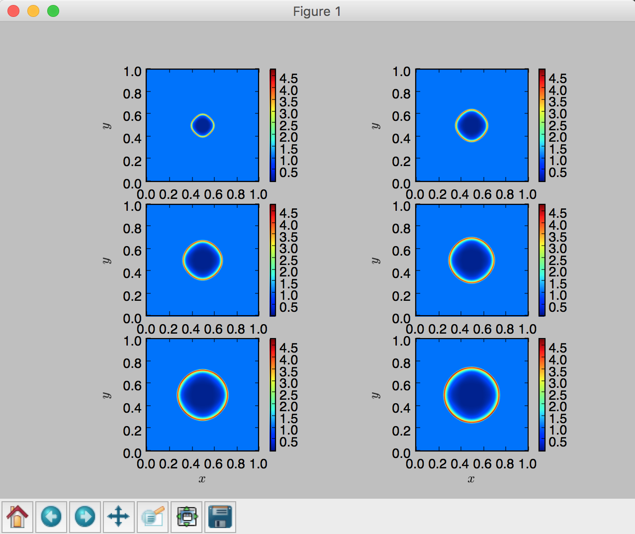
Figure 10: 2D subplots of density at various times.
You can learn more from the provided examples from Matplotlib tutorial pages and see how you can plot them: